Tuesday, November 25, 2014

Animals as Symbolism


There were so many things to write about from these last two chapters we read and I didn't know what to choose. So I went with another love of mine and that was to reflect upon Animals in Art and the associated symbology. I especially love the Push Pin Studio philosophy behind Conceptual Art and Image:

"The Push Pin approach is less a set of visual conventions or a unity of visual techniques or images than it is an attitude about visual communications, an openness to trying new forms and techniques as well as a reinterpreting work of earlier periods, and an ability to integrate word and image into a conceptual and decorative whole."


Armando Testa for Pirelli Tires, 1955
This Armando Testa advertisement for Pirelli Tires speaks volumes about their tires. Wouldn't you want your tires as tough as an elephant? Yes! The elephant is an African Bull elephant, what can be tougher than him? The style of this poster speaks Plakatstil to me with the lower case serif font announcing the manufacturer name in all caps. This poster exudes the toughness of a bull elephant


 Roman Cieslewicz, circus poster, 19621
 Roman Cieslewicz was born in what's called The Second Generation of The Polish School of Posters2. This poster evokes a different side of the elephant. The one in this poster is an Asian elephant, the species usually performing in circus's. Cieslewicz captures the surreal and abstract feeling that a circus offers the audience. Controlling the pace of the elephant is a clown of text. You don't see him right away, the font is so abstract until you look close and realize the black and purple striped item on the elephant is really the clowns arm holding the string directing the pachyderm. The elephant is surreal, which contrasts eerily with the clown and begs the question -  how can the clown control him with just a string?


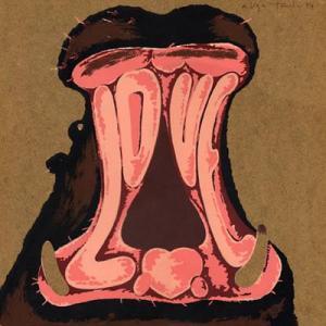
Armando Testa - Ippopotamo Innamorato
Armando Testa, Ippopotamo Innamorato, 1982, Arcadja Auctions

Armando Testa loved creating illustrations with animals and really experimented with fonts. The gaping maw of the hippopotamus is really showing us some love. But the abstract nature of the illustration first reminds us of how often we see hippopotami in this same posture. This poster definitely shows us the eclectic styling of Conceptual art, complete with a little heart as his tongue.

This chicken image is really fantastic in that you don't realize at first that he is made from the letters "p" and "n". The feet, lobes, waddle and comb are painted and the wings created with a lowercase 'p", the breast in the "n" and she is perfectly shaped into the chickens we all know. Testa experimented with this technique by changing the weight and sizes of each "p"; he clearly had this technique mastered and a sense of humor to boot. This illustration reminds me of the Calligrammes made popular from 1913 to 1916 by Guillaume Apollinaire, but instead, we have poultry in motion rather than a poem.
chicken
Armando Testa, the "P" Chicken,
http://www.printmag.com/design-inspiration/pornography-without-sex-2/  
Milton Glaser for Eros Magazine, 1962


.


I had to find something from Milton Glaser because I really like his work. This illustration is so simple, but when you take a close look, it is quite detailed.
 In this sketch he really demonstrates that "desire for originality; a thirst for the new; and a reverence for the precious, unique art object".1


These illustrations demonstrate to me how an artist can take an animal and make it playful, serious and tough. I enjoy the artists that have this ability because it really is a clever talent. Especially when the animal is connected to a product like the Pirelli tire poster.

Citations:

  1. Philip B. Meggs, A.W. Purvis, Megg's History of Graphic Design, John Wiley & Sons, Inc., New Jersey, 2012
  2. Circopedia, The Polish "Cyrk" Posters,  http://www.circopedia.org/The_Polish_%22Cyrk%22_Posters

Tuesday, November 18, 2014

Art & Feminism


Deciding to have a career instead of having a family is a very difficult choice for most women to make. But the women we met in chapters 18 - 20 broke barriers for the rest of us to walk through. Whether it was a choice for them or not, I couldn't find any information. However, Feminism is a loaded topic, and the last three chapters introduced us to  ladies who really made an impact on the world of graphic design whether they had a feminist outlook or not.

These women were sassy, edgy, risky, confident, determined, fearless and filled with talent. So what set them apart? How did their work differ from the males they worked alongside? Or did it? Were these qualities reflected in their work? I had to take a look.

These women had style and were able to create new styles, which catapulted them into becoming forerunners of new graphic design created by Women. Not only were they taking the word form into a new direction, introducing it as illustrations and typography, these were advances usually presented by men. They were able to step outside of the box and explore "wit, invention and the grid to reach the essence of each subject".4

The male bosses, colleagues and designers they worked with recognized this talent and supported them. Not to say these Ladies didn't encounter adversity along the way, they probably did, many times, but they didn't let it stop them. They forged forward making names for themselves and revolutionizing the theme - Women in Graphic Design.

A quote from Nicholas P. Negroponte talking about Jacqueline S. Casey and her contributions to the MIT Design Services Office sums her up very nicely:

JSCasey_001.jpg (371×363)
Jacqueline S. Casey at MIT2
'"We had lunch together almost every day for four years. During that time I loitered in the offices of Design Services where I learned all I know about graphic design. I learned how a design could be at once Swiss in its cleanness, Italian in its imagination, and playful like Jackie herself. . . Jackie always says she cannot teach. Ha! She doesn't need to. She has already taught thousands of young designers through her work. . . Those of us who have had the privilege of working with Jackie did nothing but learn from her insights. She captures the essence of a design program in less time than it takes most of us to understand its constituent parts. What is most extraordinary is that she does all of this with profound humor, which, in my mind, is what separates great from good design."'1
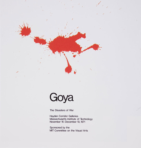
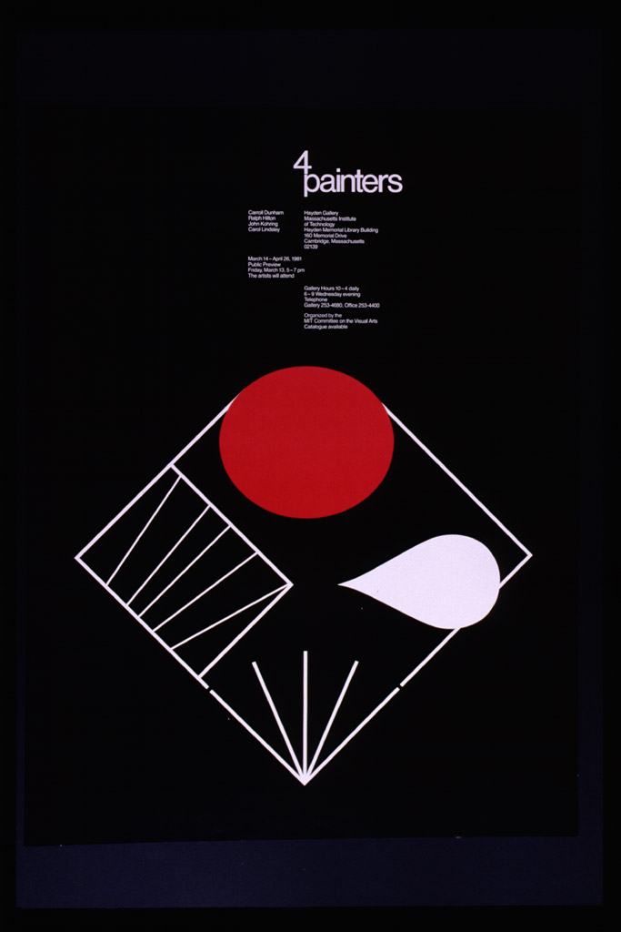
Her constructivist stylings were descriptively simple, expressive yet concise, blending with the written word.


Can_05
Jacqueline Casey poster for "Goya: The Disaster of War", an aquatint exhibit of Goya's work, 19714


http://library.rit.edu/Images/posters/casey/hires/3099.jpg
Example of using "the grid", Jacqueline Casey, 19715

The incomparable Cipe Pineless, pronounced "Sea Pea Pin-ell-ess".7 The only one that I could find evidence of a husband or two, and at least one child, was an Austrian Jew who survived a Bolshevik raid in her homeland then emigrated to the U.S. That alone makes you tough, however Cipe wasn't able to obtain the employment of her dreams until the 1940's. However once there, she did blast through that glass ceiling with her sharp eye for design and a "cultured sensibility" that earned her high ranking positions at Seventeen and Charm magazines. She wasn't afraid to push that envelope and put into print, the skills of women.
MD_Pineles_Portrait_640
Cipe Pineles in her studio at Conde Nast, late '30's or '40's


MD_Pineles_Parking_640
Editorial spread from Charm, January 1954 issue, pages 128-129, photographed by William Helburn7

Her assertiveness and talent would pull the image of women out of the territory of giggling idol worship and finding a husband to that of thoughtful and intellectual young people.

Maybe the answers are already here. Sass, energy, determination, confidence and immense talent set them apart. It was a more modern
Deborah Sussman
Deborah Sussman, Photo: Jim Simmons, 20093
world and the value of women in the workplace was changing, they knew it and were not afraid. Their work differed in that they were able to demonstrate whimsical, analytical and a collaborative side of graphic design that didn't sacrifice form, function, clarity or inventiveness. And they were relevant, their design styles original, inventive with intuitive organization that they were able to put into magazines, posters, exhibitions, concerts and the 1984 Olympics. Yes they may not have been the first to create a style, but they were the first to make it successful!


Deborah Sussman at the 1984 Olympics6


Citations:

  1. The MIT News, On Campus and Around the World, Obituary for Jacqueline S. Casey, May 1992, http://newsoffice.mit.edu/1992/casey-0520
  2. MIT Museum, The Poster Art of Jacqueline Casey, 2008-2014, http://web.mit.edu/museum/exhibitions2/casey.html
  3. Museum of California Design, Designing Women Award Benefit and Auction, 2012, http://www.mocad.org/benefits/benefit2012.html
  4. Elizabeth Resnick Beyond the canon, Women at the edge of technology, Eye Magazine, 2008, http://www.eyemagazine.com/feature/article/woman-at-the-edge-of-technology
  5. FFFFOUND, Find, bookmark and share your favorite images!!, http://ffffound.com/image/0414c5ed5bb44e1b045ece25dd19abb8d345da80
  6. Christopher Hawthorne, Metropolis magazine, She Loves L.A., March 2014 http://www.metropolismag.com/March-2014/She-Loves-LA/
  7. Vici MacDonald, The Cultured Sensibility of Cipe Pineless, Eye Magazine, 2005 http://www.eyemagazine.com/review/article/the-cultured-sensibility-of-cipe-pineles
  8. Cipe Pineles,Biography by Martha Scotford, The American Institute of Graphic Arts, 1998, AIGA Medal, http://www.aiga.org/medalist-cipepineles/


Tuesday, November 11, 2014

History Repeating Itself?

Recently the PBS Channel aired the mini-series, "The Roosevelt's: An Intimate History" and I was struck by the similarities of what the American public is experiencing today.  Never to diminish what the people of Europe, American and Japan experienced during both World Wars, but the solidarity that grew out of the atrocities is still felt today. That solidarity grew out of programs that sprouted from the New Deal.
http://0.tqn.com/d/womenshistory/1/S/B/m/2/WPA-women-painters-a.jpg
W.P.A. Recruiting Poster for Women Painters, 1935-1943

Some may consider our  economic climate right now as a sort of depression, or a deep recession, with people losing their jobs, starting "Victory Gardens" to relieve the emptiness in wallets and cupboards, in addition to the original mission to support the troops and helping our neighbor that might not have enough.

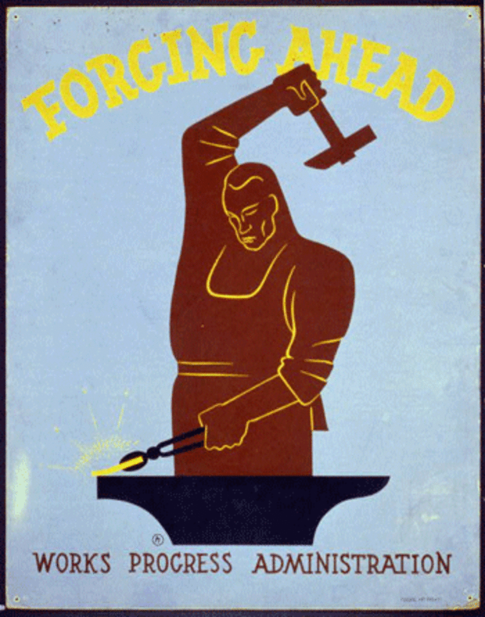
These social and economic programs brought self-worth to the American public. Members of the public were recruited for the Civilian Conservation Corps or CCC to plant trees, build parks, restock rivers with fish, and other various projects to preserve and conserve our natural resources. Other programs borne out of the New Deal recruited artists, actors and musicians. This was a painful time and the New Deal was the President's solution for pulling the American People out of the Depression and on the road to recovery. It was incredible, the American Public responded positively and the messages promoting Recovery was promoted through the art world. Women had more purpose than just staying at home, in the kitchen cooking and cleaning. Working towards the betterment of America carried a lot of pride and the posters from the W.P.A. pushed that message forward.
http://www.socialwelfarehistory.com/wp-content/uploads/2013/05/images-4.jpg
My Motto, W.P.A., 1938

My Father was born at the beginning of the Depression, my Mother born in the middle, and Franklin Roosevelt was the only president they knew growing up. If it wasn't for the strength of my parents and what they had to endure as they grew up, got married and had children, I don't feel I'd be as strong as I am today. As I look back on the posters my Dad hung in the garage, they were very constructivist and Bauhaus. Of course I didn't know it then and it makes sense why some of these posters feel familiar. This adjacent poster was created for the W.P.A., the most popular of Roosevelt's programs, but people questioned the worth of the project because artists were earning a high wage sometimes higher than the contractors. But that query was put to rest because "Hell! They've got to eat just like other people." sang Harry Hopkins, Head of the Works Progress Administration.3


I've worn many hats in my career and in my current career, wear the hat of an "Environmentalist". It was a position I took pride in because I was working on projects that had meaning, that dealt with the real issues we face in our communities and in our state. Most recently my work has involved the collection of spatial data for our drinking water systems in California. A very important topic today as we face a drought. However, as the news However, last week I was delivered a big blow and given a 30 day lay off notice because the research unit I work for ran out of money. So I have 30 days to clean out my office, sign up for unemployment and look for a new job. Is history repeating itself? What do I do in the meantime? Start a new art movement and forge ahead!


Wpa New Deal The new deal worked!
What we have to do, W.P.A., 1935-1943


Citations:

  1. TV Review: "The Roosevelts: An Intimate History", Brian Lowry, 2014, The Variety, https://variety.com/2014/tv/reviews/tv-review-the-roosevelts-an-intimate-history-1201298279/
  2. The New Deal, Franklin D. Roosevelt American Heritage Center, Inc., 2008, http://www.newdeal75.org/index.html
  3. The Social Welfare History Project, John E. Hansan, Ph.D., 2014, http://www.socialwelfarehistory.com/organizations/wpa-the-works-progress-administration/
  4.  Image Arcade, http://imgarcade.com/wpa-new-deal/


Tuesday, November 4, 2014

BP_6 The Angry Age

People were angry, the photomontage was getting some interest and less is more was turning into the theme of the decade. And most interesting of all was the growing popularity of the Poster. The Poster had become the vehicle to capture the attention of the populace. Pictorial Modernism pushed the "communication needs of war" onto the Poster. 
Artists were moving past the complexities of Art Nouveau and working with colorful, cut pieces of paper, words were tossed onto the page, and the messages were surrounded by white space, shapes, and one or two colors.  But the messages were clear, there was war, people were outraged and tradition was tossed aside. 

Futurist artwork is very appealing with its disregard for the traditional book layout.

Typographic arrangement
Les mots en liberté futuristes (Futurist Words in Freedom), published in 1919

Poetry in Motion or Calligrammes would communicate messages of Peace and War in shapes and forms rather than the traditional book layout.


http://upload.wikimedia.org/wikipedia/commons/a/a3/Guillaume_Apollinaire_-_Calligramme_-_Cheval.png
Guillaume Apollinaire, Calligramme, Cheval, 1913-1916


I love the ideas behind Futurism and find the two-colored posters, books and cards clean and crisp -

A two-colored treat "on how to handle Chicanos" by Jose Angel Gutieerrez


Dunlop tires
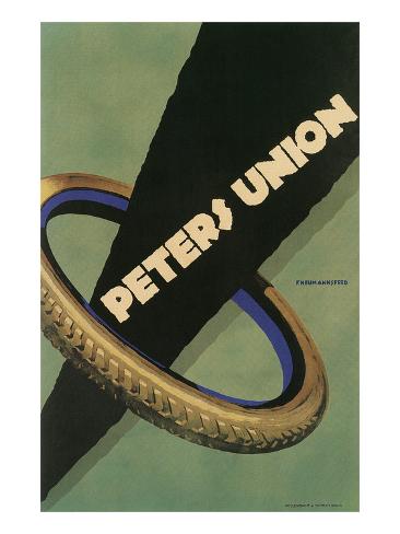
However I do have to say that Plakatstil and Sachplakat are my favorite of the late 1800's and early 1900's. The colors were daring, bright and few and the subject matter simple and flat. It is truly amazing how artists such as Lucian  Bernhard could create so much movement and expression with so few pieces on a poster. Nothing grabs your attention more than a colorful poster with few words and images.  Peters Union Tires Art Print I can remember reading a freeway billboard  change its message for months.  Each month on a green background, the message in black font would change from 


  • He's coming
  • He's almost here
  • He has arrived
  I couldn't wait to find out what it was. Finally the day came only to discover that it was advertising for a new rum. The last billboard on the green background, Captain Morgan himself:

http://www.logovaults.com/logo/6818-captain-morgan-logo-jpg


Not being a big rum drinker, I was a little disappointed, and even though the image here isn't Plakatstil, I was pulled into the minimalist poster until the end. I thought it was the best advertising ever!

However, I diverge from the real topic at hand and that is the Age of Angry and moving away from the traditions of the past. For starters, Futurism, DaDa, Constructivism helped move people out of the shadows and into the light. Communication was huge and people wanted to get heard. As the turbulence continued, so did the need to communicate feelings. Artists were creating art forms for shock value and doing some great things - cubism, De Stijl, surrealism and expressionism. These times set the stage for the future. The future of shock value and artists continue it today. 

In lieu of poster-work, artists use the sides of buildings as their canvas to shock the people. Boxcars display incredible messages through art using spray cans and the poster is still widely used but doesn't have the power it once had. But the Shock Value of the Poster set the stage for artists of today. And figuring out how to portray less is more to get your point across.

Zemog Mindset Stencils, 2014


Artists became defiant and controversial as artists will do. And that hasn't changed since the turn of the century. It had only begun.


fight your Revolution with Paint, Zemog Mindset Stencils, 2014